Showing posts with label logo. Show all posts

Monday, August 11, 2014

At the Center of You - Logo

Hi All,

Wow - it's been a busy couple of weeks.  Between holistic therapy work, this logo, and some other stuff....it's been a quick, busy time (and a good time).  It's really good to be busy sometimes.

So a lady named Laurie hired me to do a logo for her business, a couple weeks ago.  The biz, At the Center of You, is her new business.  She's opening it in Wickenberg, AZ.  Wickenberg is kind of a cowboy town about 70 miles NW of Phoenix.  Her business consists of her life coaching, hypnotherapy, and other holistic modalities, plus a little merchandise for sale.  It's also a very unique business in that town with a large potential.

So we sat down and started brainstorming.  What we came up with was the image of a horse sitting on a mat with legs crossed meditating.  It bridges the gap between the holistic/spiritual aspect of the biz and the old west feel of the town.  It was fun how we really clicked and both came to this idea really quickly.

Pencil sketch of the logo design for "At the Center of You"

First I sketched the cartoon horse logo and she approved, right away.  She was very pleased.

Pen and Ink - complete with coffee spill.

Next I drew the illustrated master drawing in pen and ink.  I even spilled coffee on it (as you can see in the photo).  My scanner is out of commission - so I start working in the computer, on the pen and ink photo.

drawing the black and erasing the white - in progress

I took the photo into Photoshop.  Selected All, and copied and pasted on to a new layer.  I colored the base layer completely orange and started defining the illustration by erasing the white on layer two.  I used the pen tool and would draw a path around an area, color it black, select the area, select inverse and erase the white around each section.  Hope that doesn't sound confusing.  I know it's definitely not the industry standard way of doing things, but that's ok.  It works.

black and white logo complete.

When I got the nice crisp black and white picture done, I saved the layers and starting adding layers under the black and white layer, and began adding color.  Laurie gave me her business card, told me it reflected her personality - and asked for the logo to be reflective of that.  The card had a robin egg blue color with a script type style for her name and a light san serif type style for the rest of the text.

adding sky color

So I started adding color to the background.  Trying to be consistent with the feeling of Laurie as reflected in her business card.

working on the horse.

Once completed, I did spend a little time, tweaking the color a bit, and then formatting both black and white and color, for both print and for electronic/web use.

Completed logo design

Again - this was a fun job.  I enjoyed working on it and the style of cartoon type logo, is really in my wheelhouse.  She was happy with the logo and it really met all of her criteria.

That's it for now.  Enjoy the coming week.  Be present and enjoy those around you.  Enjoy being with yourself as well.

Peace,

Tom

Art Portfolio - www.behance.net/tk-art
Facebook page - www.facebook.com/pages/Tom-Kreienbrink-Art-and-Design/

Tuesday, June 3, 2014

Color Logo design

Hi Everyone,

How are things going out there today?  Things are pretty good here in Phoenix.  Its warming up here - 110 degrees today...Hot stuff!!  I've got a slow week scheduled - so call now for a massage or other holistic therapy appointment.  Saturday we're having an holistic fair at work...should be fun - come on out if you're in town - it's free.  You can also sign up to win a gift basket worth $1500.  Not bad.

So a while back I decided to take my old black and white logo (from my art business), and add some spot color.  I created the logo probably about 17 or 18 years ago and the original medium was technical pen on bristol board.  The tools on the logo (brush, airbrush, and technical pen, pencil), are the tools I've been using to create artwork for over 40 years now.

The Tom Kreienbrink Art and Design original black and white logo

Of course now days I use a computer most of the time working with artwork and design.  The real work is always done in one place...the mind.  I also still work out design ideas with pencil and paper before taking it to the computer.  However - the color logo was done with IMac, Photoshop, and Wacom tablet.  Below is the finished color logo.  I haven't used it anywhere, but here yet.  It's nice to have a color version available though.

The updated color logo

I hope things are going well for you out there.  Whatever you're up to, enjoy yourself.  Do your best.  Do what's right.  And let the chips fall where they may.  Have a great week.

Peace,

Tom

Art website  - www.behance.net/tk-art

Holistic Therapy - www.HolisticTherapySolutions.weebly.com

Friday, January 31, 2014

Blu Lotus Pathways Logo Project

Hi All,

It's been quite a week and I'm ready for the weekend.  Saturday is the holistic fair at work where I'm going to be offering 20 minute, Stress Relieving Hypnosis sessions.  Sunday - the Super Bowl.  I'm going to be making a big pot of chili and we'll be having the kids and some of their friends over for the game.  It's going to be fun.

Today I want to spotlight a logo that I developed for and with a friend, Tiff Vacca.  The logo is for her business, Blu Lotus Pathways.  Over the last few years I've had the privilege to work on some projects for some friends that I've gone to school with and this is one of those projects.

When Tiff and I originally sat down to discuss this project, she already had the name of her business. The lotus and the path (pathways), were very important symbolic images that needed to be represented in this logo.

Logo - Blu Lotus Pathways
So I got to work.  An idea that Tiff really liked was the blue lotus flower coming out of the U in Blu and a pathway also emerging from that U.  I found this concept to be a challenge and began putting ideas on paper with pencil.  It took a little back and forth with ideas, but we eventually came to the concept that would become the finished logo.  In the mean time, I had started working on the lotus flower, illustrating it in Photoshop.

Above is the finished artwork.  The symbolism of the lotus and the path have a very deep personal symbolism for my friend and client.  I felt that bringing it together in a circular (technically oval), shape follows the symbolism and brings it all around, "full circle."

Sunset in Cave Creek, Arizona....beautiful.


I'm proud and honored to have been able to help out with this logo.  You'll find Tiff and Blu Lotus up in Cave Creek, Arizona.  She's an outstanding massage therapist and also offers Reiki, Cranial Sacral therapy, and more.  If you're in Cave Creek, check out Blu Lotus or on Facebook at www.facebook.com/blulotuspathways

Have a great weekend everyone.  Enjoy the Super Bowl, or like some folks...the Super Bowl commercials.  Be good to each other too.

Peace,

Tom

www.facebook.com/pages/Tom-Kreienbrink-Art-and-Design

Monday, November 25, 2013

GLori Hallelujah!!

Hi All,

It's Thanksgiving week.  Thursday is Thanksgiving Day, one of our favorite holidays where we take a break, gather with family and friends, and give thanks for all the...For Everything.

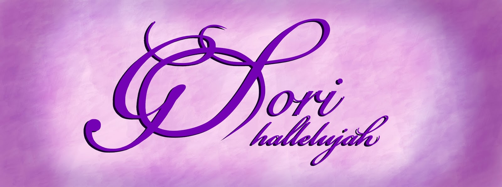
Recently I was contracted to do a logo that seems to fit the theme.  The name of the company sort of sounds that way anyhow.  The logo is for an on-line shopping site called, GLori hallelujah.  It's really a cool site and a great deal (so check it out www.facebook.com/GLorihallelujah ).

The client's name is Lori.  "G" is what her grandkids call her.  "hallelujah" fits with the gratitude she's in for her family, her life, etc...  So, GLori hallelujah is the name she chose for her company.  I like it, it's catchy and it's personal, but she needed a logo.

Lori liked a script font spelling of the name - but, like the name of her company, it needed a personal touch.  We kicked around some ideas but they still weren't quite working.  Then she sent me her handwritten name and pointed out the unique manner in which she makes the L.  It all fell into place around that handwritten L.

Logo for GLori hallelujah - violet version
As you can tell, the L is a unique style - very personal to my client.  I made the sizes of the script typestyle varied and linked the G and L together, to balance out the logo.  Lori likes it and I feel like it works.  It's representative of my client and her company in a very personal way.

GLori hallelujah Facebook cover photo version

I made a black and white and 6 other versions; basic colors and metallics.  I also put a handful of Facebook cover pics together (like the one above).  Since social media is such a big part of marketing, these will come in handy.

Metallic Silver logo version

Christmas Facebook Cover photo version

Violet Facebook cover photo version

So Glori Hallelujah - have a great Thanksgiving everyone!  Every day is a great day to be grateful, but this coming holiday season, I hope you have the opportunity to take even a small break, and enjoy a little relaxation with some special people.

Be good out there and always take the opportunity to say something nice to another person.  Be good to  each other.

Peace,

Tom

My online art and design sites:

www.behance.net/tk-art
www.facebook.com/pages/Tom-Kreienbrink-Art-and-Design