Monday, December 26, 2011

Holiday Wishes - e-Christmas Cards

Hi Everyone,

Happy Holidays, whatever Holidays you celebrate.  Personally, I celebrate Christmas.  It's been a busy fall and start to Winter.  School's keeping me very busy, and the holidays are always a busy time around here too.

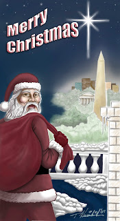
Today I thought I'd highlight some of my Christmas Cards that I've created in the past.  I've made many over the years, but I've got three here today.

2011 Holiday Card - digital art
The artwork above is the card I sent out this year even though it was really a last minute "throw together."  I came up with an idea, scanned in a pencil sketch and went to work.  I decided to have some fun with it...after all, it is Christmas.  I love using the program Painter, with my Wacom Tablet and Mac computer.  Most of the picture was "painted" with the chalk tool in Painter.  I wanted to have fun with a loose, fun, chalk or crayon type illustration.  When finished, I posted to Facebook and sent out to friends and family attached to an email as well.  I just don't send cards in the mail any more (judge me if you will, but that's a tradition I don't do).

2010 Card - digital art

The 2010 card was a little bit generic, but it also reflected our location and also the Christmas star, that led the Wise Men to Bethlehem.  We had moved to the desert last year from the East Coast of the US.  I love Christmas in the desert, reflected in the mountains and cactus with lights.  This one was more of a simple and clean design, produced on computer using Photoshop and sent out via email and social networking.

2009 Christmas Card - digital art
Finally, the 2009 Christmas Card.  This one started with a little more developed pencil sketch, painted with Wacom Tablet and Photoshop.  We were still in Washington DC, so I've got Santa on the White House roof top with monuments in the background, and the Star guiding to Baby Jesus in the manger.

This was fun and I put a little more detail into it than some of my cards.  I also created individualized cards with this theme for some colleagues at work and a few others.  I also sent it out in a wider distribution via electronic media.

I hope all of you are having a very happy and peace filled Holiday Season, whatever holidays you celebrate.  Merry Christmas and have a Joy filled 2012.

Peace,

Tom Kreienbrink

Wednesday, November 9, 2011

Pen and Ink Cartooning

Hi All,

Well, I've been cleaning up a couple old cartoon scans and decided that this weeks blog should highlight some of my pen and ink cartoon illustrations.

Day Tripper

The first - a guy I've been drawing since I was a young kid.  I call him the Day Tripper.  I've drawn him on a unicycle, in stocks, hitchhiking and doing all kinds of stuff.  Although I grew up in the 70s, it's clear I was influenced by the hippies of the 60s.  Yes - I think it's true that this is some kind of alter ego character.  I've often thought of developing a comic or cartoon strip around the character, but never did.

Cartoon Self Portraits

Above: self portrait cartoons.  The one on the left is circa 1995 and the one on the right is recent.  In the 90s I was a medical illustrator in training hospitals.  I used to fool around with cartoons of me and the photographers, using them for funny signs and not so serious self promotional items.

Promotion Item Artwork for a couple of events at
Offutt AFB, Neb.  Circa 1995-96
A couple of cartoon style illustrations from the 90s.  The one on the left used to promote the EMT Rodeo and the one on the right was used for the Offutt AFB Runway Run Tee Shirts and posters.

Jerry and Ron - Medical Photographers
Circa 1993-96

Above are toons of two of the medical photographers I worked with at Offutt AFB, Neb;  Jerry King and Ron Kikel.  These guys were amazingly talented.   The work they did was vital to the training programs in a facility. They were also my friends...we had more fun than people should be allowed to have at work.  We worked hard and played hard too.

Cartoon greeting card for my parents
(caption in word bubble changed for blog)

Lastly is a card I gave to my parents.  It was set in our apartment on Capitol Hill in Washington DC.  It was a great little apartment....good times.  It had a different caption in the word bubble, but I changed it for the blog.

I hope all is going well for everyone reading the blog.  I hope you enjoy it and that you are enjoying life.
Bless you all.....

Aloha,

Tom

Friday, October 28, 2011

In Honor of Fall and Our Nations Capital....

Hi All,

Well, it's fall again.  In a lot of places the leaves are turning orange, red and yellow and are starting to drop.  It's finally cooling off a little here in Arizona too.  And, football season is well under way here in North America.  So I decided to break out a picture I did a while ago for some friends.

Riggo - Pen and Ink with digital color

I lived in the Washington DC area for about 8 years and created this piece for some friends who are huge Washington Redskins fans.  The artwork commemorates the former Redskin great, John Riggins (or Riggo for short).  I know not all of you are fans, but  Riggo is a revered sports hero in the DC area.  He's a big ol farm boy from Nebraska who was a powerful running back in college and in the NFL.  He played for many years as a Redskin and on more than one championship winning team in Washington.

The technique I used is one I enjoy quite a bit.  I start out with reference material and sketch out my design.  On this one I liked the idea of incorporating a scene from one of the Super Bowls he starred in, his number, name and the team mascot in the background.

Riggo - Pen and Ink version

Next I render a nice tight pen and ink drawing.  Personally, I really enjoy pen and ink.  I used it a lot when I was starting out because we did a lot of one color printing.  I use bristol board and Koh-i-noor technical pens.  The thing I like about it as well, is that the pen and ink is a stand alone piece of artwork (I like it better than the color piece myself).  And after I add the color it can be used as a dual purpose piece.

After completing the inked artwork I scan it in to my Mac.  Then I use Photoshop and my Wacom tablet to paint in the color.  A couple things I like to do are first; touch up the pen and ink in Photoshop.  I want the black image on a layer by itself in Photoshop and I want it to be tight.  So, it takes a little touch up work and time.  Then, I can paint in the color on a layer beneath.  This keeps the black image crisp with the color popping in thru the area that they should.  I normally have several layers of color while working on it.

So, here's to all you Redskins fans and DC area residents; enjoy the beautiful Fall weather out there.  I know the Skins aren't having their best season, but hang in there.  The rest of you - enjoy yourself, wherever you are.

Have a great week all.

Aloha,

Tom

Monday, October 10, 2011

Go Brewers Go - Ryan Braun Illustration

Hi All,

Hope you're all having a good week.  As a native of the state of Wisconsin and a sports fan, I've got to say, it's been a lot of fun lately.  The Packers and UW are having great football seasons, UW and Marquette University basketball teams are consistent winners, and now the Milwaukee Brewers are in the playoffs for the first time in a long time.

I don't define myself by sports, but I've always enjoyed playing a variety of sports and watching my teams.  As an artist one of the subjects I enjoy working on are sports figures.  I was inspired to work on a fun illustration of my favorite Brewer, Ryan Braun.  This guy is the complete baseball player, reminiscent of guys like Paul Molitar and Robin Yount.  Anyhow, enough about me, here's the finished piece.

Braun - finished piece is high resolution, approximately 10" x 8"

Here's the technique I've developed that I like to use for some of my sports pictures (and it can be used for other art work as well).  It's easy and fun, but can be a little time consuming sometimes.  I start out with a pencil rendering of the subject.  Of course I work off of photo reference and use a variety of hard to soft pencils.

Initial pencil sketch after being scanned.
 
After scanning in to my iMac, I start working on the image; sharpening the images and the details.  I also try to bring out stronger values throughout - darker darks, crisp highlights and good contrast.  I normally use Adobe Photoshop and a Wacom tablet with a pen stylus.  I work it with greyscale values and also use varying opacity settings on the brush.

Pencil rendering after working lights and darks and
sharpening details.
Above is a little more fleshed out version of the pencil sketch.  You'll see I've added much more detail in the features throughout.  The darks are much more solid and even the lettering in the helmet logos and jerseys are tighter.  Sometimes I think I want to be a little too tight, but hey - that's how I roll.

In progress, after working in layers of color and texture.

Finally I start layering in various shades of blue.  I use a variety of blue hues.  I use a number of layers and differing levels of opacity on those layers.  It gives a nice layered and textured look.  I also use various brush shapes to really punch up the texture as well.  Finally, I add the name, rasterize the text and work the color on it.  Finishing touches also include a nice border to hold it all together.

The final piece.....Go Brewers!!

There you have it.  One of my favorite ball players, who is tearing up the playoffs.  Go Brewers!!  I hope you're enjoying your lives and your artwork wherever you are.  If you're not an artist, I hope you enjoy the blog and the artwork too.
Have a great week everyone.

Aloha,

Tom

Tuesday, October 4, 2011

Life So Magical

Hi Everybody,

I'm back!  So last week, I'm looking around on Facebook one afternoon and another student at my school posts that she needs a designer to help right away.  So I sent her a message and told her I could help and here's my nice little surprise job.

An electronic version of the original color ad to be
printed in a four color glossy magazine.
Size 4 x 5 inches.

Jenny, the proprietor of Life So Magical, needed a high resolution layout for a 4 color glossy magazine ad.  Unfortunately the only artwork she has is a website that has some low resolution imagery.  And - the deadline (we thought at the time) was 6 pm that evening.  So we got to work.  I pulled her imagery off her site and started working it into a new, high resolution background.

I started by bringing the person, landscape, and cloud image into Photoshop.  I removed the background and manually did some "cleaning up," with the brush tool to sharpen the silhouetted image.  I also worked on blending the clouds a little and did a little airbrush in them as well.

I then started recreating the background with the lens flare, the title and subtitle.  By the time I had this done, Jenny sent the copy to me and I started playing with sizes, colors, space, etc.  I brought a nice photo of her in from her Facebook page and dropped it into a soft pink box with her contact info.  After going back and forth a few times (via email), with ideas and text changes, we had the finished ad.  Then we found out we had until the following evening to have it in to the publisher.  Oh well, it all worked out.

Email Banner for LifeSoMagical to use in business emails.

We discussed a working on a couple more pieces afterwards as well.  From the original material, I put an email banner together.  She'll be able to have it highlighting her emails.  I also put a 2 sided business card together for her.

2 Sided business card design.

Of course I saved a low resolution version in RGB for her to post on various internet sites or on her own site.  And the printer received high resolution CMYK artwork to print in the magazine.  I sent it to them in a Press Quality PDF which is an excellent format for most printers to work with.

Have a great week everyone.  Smile.

Aloha,

Tom

Tuesday, September 20, 2011

George Harrison Sketch

Hi All,

Well - it's been a while since I've updated the blog.  I've been pretty busy with school, but I also need to continue producing artwork...that's one of the things I do.  As a matter of fact I stumbled into a design project today - for a friend on Facebook.  That was a nice surprise.

So I saw this great old photo of George Harrison.  I've always loved the Beatles including George, the quiet one.  So I sat down with a selection of pencils and sketch book and thought I'd have a little fun.

The sketch after being photographed and
touched up in Photoshop.

Being relatively happy with it, I thought I'd post the sketch, but after downloading my terrible attempt at photographing the sketch I figured I'd clean it up in Photoshop a little.  So I added a little color around the edges and did a little dodge and burn to work on the tonal values.

Here's the scanned in touched up version
(first version).

Well, I couldn't really stop there.  So I started working a little darker color in around the edges with the airbrush tool.  I had to work on a couple touch ups and finish with a little bit of a sepia tone over all to give it a little bit of an "arty" touch.  Arty being a technical term - ha, ha.

Here's the sketch photo - took the photo of it taped
to my studio door with natural light.
(don't hire me to take photos)

I didn't spend a lot of time on it, but it was fun, and I probably spent more time on it than I planned, but thats just kind of the way I am.  Enjoy All and have a great week...I'll keep blogging (hopefully a little more regularly).

Aloha,

Tom

Thursday, September 1, 2011

Fun With Anatomy

Hi All,

OK - I know what some of you are thinking - that's probably not what I had in mind when I titled this post, "Fun With Anatomy."  What I did mean is this.  Recently I've been playing around with colored pencils and anatomy pictures - having some fun with Anatomy.  Why?

I started taking classes at Southwest Institute of Healing Arts (SWIHA), about 6 weeks ago.  I'm working on an holistic health degree and one of my first classes is Anatomy.  Anatomy consists of learning about the inside of the body; bones, muscles, nerves, tendons, and all that other stuff too.


The text book and teacher both recommend coloring some of the anatomy pictures.  It's a technique to help learn.  Anatomy can be a little bit of a dry subject; learning and memorizing latin and greek names for all of the hundreds of body parts can get a little overwhelming.  So looking at the subject matter in a completely different way, can really help get the info into the brain.


Coloring the pictures in the workbook and handouts has been fun and helps break up some of the monotony of memorizing all of this stuff.  Of course, me being an artist, I started having some fun; mixing up colors and shading - maybe getting a little carried away.


I used to work with colored pencil a lot and like to work with medium to soft colored pencils best.  I've got a variety, but my favorite are Prismacolor.  They make a great colored pencil.  They blend well, have good coverage, and are easy to work with.

So far I'm doing well in my classes.  I don't know if it has anything to do with coloring anatomy pictures, but I'm having a good time with it.


As I'm working toward my degree, I'll still be working on artwork and design projects.  I'll still be working on the blog as well, and hope you enjoy it.

Have a great week everyone and remember, whatever you're doing, try to have some fun with it.  Find your purpose in life and incorporate that into your daily life; your work, relationships, etc.  Even when studying Anatomy, you can still have fun with it.

Aloha,

Tom

Monday, August 22, 2011

Going Away Artwork

Hi All,

I hope you're all doing well.  I'd like to feature "going away art" today.  Here's what that is.  If you're part of an organization that may have members moving on every now and then, you may consider developing some type of art to reproduce as a unique going away gift.  It can be a nice memento that you can personalize easily as an added touch.

As a career Air Force member, I've done my share of moving around.  Over the years I've collected a number of plaques and photos and things from various places, given to me as going away gifts.  As an artist, I thought - "why not come up with something unique, reproducible, and maybe something that we could easily personalize or use as a fundraiser.  So I started developing pen and ink artwork that could be reproduced, given as gifts, and easily framed.

Prime BEEF - 11" x 14"
Pen and ink on bristol board.

The picture above was done for the 11th Civil Engineer Squadron (CE), in Washington, DC (where I was First Sergeant for a few years).  Their deployed mission is called "Prime BEEF" and is represented by a bull - so that was a major theme in the piece.  I also included a local flavor from DC and the CE corps badge (lower left corner).  I wanted to make it a fun memento that I could easily print up at Kinkos or a local print shop in a nice quality paper.  I left a "hole" in the middle to write a personalized message for the recipient.

55th OSS - 18" x 24"
Pen and Ink on Illustration Board

I developed a larger montage illustration for the 55th Operations Support Squadron in Nebraska.  They hired me to develop this as a piece they could reproduce and use as a long term fundraiser.  The piece represents the local area as well as scenes from around the base.   I did the same thing for the hospital at Offutt AFB as well.  They went over well...the hospital Commander even proudly gave one to the base Commander when he departed for another assignment.

Over the years I've done a few others as well at various places.  They're fun and can even make a few bucks for you or your charitable organization.  I'm sure this type of thing could be developed for various corporate offices, schools, charitable organizations...anywhere people come and go occasionally.

Take care all and have a great week........

Peace,

Tom

Tuesday, August 9, 2011

A couple from the Archives

Hi All,

This week I pulled a couple out of the Kbrink archives.  I've got My Eye close up and the Brain painting.  These are some very old pieces, but I still like them.  There was a time where I was stationed at a couple of Air Force hospitals and worked as a medical illustrator.  During that time period, I did a lot of traditional technique paintings/illustrations.  These are a couple examples of that.

The Brian - 18" x 24"
Airbrush, colored pencil and pen and ink
on Crescent cold press board

The brain, was used as a wall hanging in the Neurology Clinic at Carswell, AFB.  The technitian or doc could use it as a reference to explain a diagnosis or how the brian functions, to their patients.  I did this mostly with airbrush and transparent colors.  I also used some colored pencil and pen and ink.  I had a lot  of fun working one this illustration.

My Eye - 18" x 24"
Colored Pencil and Pen and Ink
(I added the beige around the eye recently in Photoshop)

The Eye was just a training piece and something to hang on the wall, when I first got to Carswell AFB.  My former supervisor Joe Brickham took a close-up photo of my eye, gave me a Polaroid copy of it - and I used it as the reference for the art.  This one I drafted on white paper with pen and ink and colored pencil.  Because Joe used a special macro technique on the photo, he really got a lot of color variation and detail, which I tried to portray in the artwork with the colored pencil.

Both of these pieces were documented on 35mm color slide film and recently scanned with a flatbed scanner that has the capability.  Unfortunately due to time gone by and less than archival conditions, the slides have lost a bit of the original luster that the illustrations once had.  It's still fun to break out some of the old work occasionally.

Everyone, enjoy your week...make it a good one.

Aloha,

Tom

Tuesday, August 2, 2011

Young Love Caricature

Hi Everyone,

Today I'd like to feature a caricature illustration that I recently completed.  My client was a young woman who wanted to surprise her boyfriend with a fun piece of artwork; a caricature that reflect the fun they have together and the appreciation they have for each other.

The ideas...sometimes I go with elements reflecting who and what the person is about - interests, career, and surroundings.  This time, I thought it appropriate to just focus on this couple and put them in familiar and fun surroundings.


The client and boyfriend live in New Mexico, so I thought it would be fun to put them in a natural setting that has a feel for the area and also put them on a horse, appealing to their fun/laid back sensibilities.  They both love New Mexico and though city dwellers, they appreciate getting out of town and into nature.

Technique: I start with a pencil sketch, working on getting a likeness and developing composition.  After scanning the sketch I start working on the details in Photoshop.  I work in several layers - one for the cliffs, one for the trees, one for the fence, one for the main characters.  I have a Wacom drawing tablet that allows me to draw and paint with a pen like tool with a variety of brushes, opacities, and of course the rest of the Photoshop tools.

When I get the image almost finished, I add a few more layers; putting in a nice beveled border created with various shades of blue, varying opacities and brush shapes.  Pulling the symbol from the New Mexico state flag; I drop those into the corners.

After going over it again and adding some finishing touches, I flatten the image and save a copy, convert it to CMYK, take it down to Kinkos and have it printed on a tabloid size glossy heavy weight paper and send it out to the client.  And there you have it.

Have a great week everyone....

Aloha,

Tom

Monday, July 25, 2011

Qui Gon Jinn Illustration

Hi All,

I've got a few projects on the boards that I'm finishing up, but I wanted to pull out a classic piece today.  A Star Wars inspired portrait of the Jedi Knight, Qui Gon Jinn.  He was played by Liam Neeson and portrayed a Jedi Master in the Star Wars prequels that came out about 10 - 12 years ago.


There was a time not so long ago, when I did a lot of airbrush work.  This was a personal piece, done for my own pleasure.  The artwork is on cold press illustration board and I used transparent acrylic airbrush paints (Comart or Golden are my personal favorite).

I started by drawing the layout on the board and then laying in color with the airbrush with no masking or frisket.  I wanted to keep the mood with a warm pallet of browns and yellows.  By not masking I got a  little soft overspray of colors that served to enhance that mood in certain areas of the piece.  The other tools on hand were an electric eraser and X-acto knife.  As I painted in more and more detail I would need to remove some of the color to define detailed areas, uncover highlights, and remove some unwanted overspray.  I would simply use the knife and electric eraser to scrape or erase the paint from the board.

The beauty of using transparent colors is they blend well.  They also allow you to work dark to light on a project like this without a lot of tedious masking.  If I got a little yellow overspray on the dark areas it wouldn't show.  The knife is a great tool for this because it let's you really show the fine texture and detail of hair and beard.  The brushes I use for this work are made by Iwata; HP-C, HP-B, and Custom Micron.  The C has good coverage and the B and Micron are great for fine detail.  Freehand airbrushing isn't the recommended approach by illustration masters, but I think with some practice you can get some pretty good results.

Until next time....Have a great week.

Aloha,

Tom

Friday, July 15, 2011

Pen and Ink Illustration

Hi All,

Sorry - I've been away from the blog for a couple of weeks.  I went on a little road trip to visit family and friends and have just been busy catching up since I returned.

Today I want to get back to basics and discuss one of my favorite techniques; Pen and Ink.  I just love it; from drawing freeform cartoons to pen portraits and caricatures, to cross hatch shading and  stippling....it's one of the first techniques I practiced and one I still enjoy today.

Pens - OK, I admit it, I'm a pen whore.  I love pens and buy them all the time; different shapes and sizes - whatever I find.  Mostly I'm looking for a great pen to draw with.  More and more, there are good pens coming right off the shelf available at most supermarkets or variety stores.  There's great disposable art pens specially made for drawing, too.  Sharpie is always coming out with new styles and ultra fine tips, as well as others like Pentel.  My all time favorite pens are the Koh-i-noor Rapidiograph pens.  Preferring no. 0 - 4 as my favorites.  And, if you take care of them they'll last forever.   Parts are interchangeable and you can use whatever kind of ink you like (my preference is a waterproof india ink).

Sensei DeValentino - pen and ink - later added color via airbrush and presented to
my instructor.  Also scanned into computer as black and white artwork,
used for promotional materials.

For illustration work, I use any and all pen and ink techniques.  I used to do quite a bit of stipple technique - it consists of defining your image and shading it, using dots.  It can be very time consuming.  Thick and thin line variation can spice up a standard line drawing.  Shading with lines or cross hatch is a good technique, but if it's too sloppy can look bad.  High contrast with solid black and white areas can provide a dramatic look.

Pen and Ink illustration - part of a tendon graft
medical teaching brochure

Leaf with raindrop - for a womens health
handout/brochure
Since the most inexpensive form of reproduction is black and white, or a single color reproduction, I've used pen and ink drawings over the years for these kind of products.  Sometimes on an instructional handout for teaching (like the tendon transplant sheet, above), or nice image (like the leaf with rain drop, above), can add a sensitive touch to a flier that demands a softer approach.

Clinton-Obama - pen and ink with computer paint
Timberlake - pen and ink with computer paint

Now, with computers being such a big part of our work and lives, that adds another medium to combine with this old standby technique.  One of my favorite ways of producing artwork is to start with a pen and ink drawing, scan it into the computer, and finish it with full color or spot colors.  It's a fun technique and can add good impact to an illustration.  The two examples above show this application.

That's all for now, I've got to get going.  That's my quick take on the old tried and true, pen and ink technique.  Give it a try again - it's a lot of fun.

Have a great week and see you soon......

Aloha,

Tom

Monday, June 20, 2011

A Texas Sized Vacation

Hi All,

Hope all you fathers had a great Fathers Day.  I did.  Well - I'm going to have to keep this quick today.  I'm  doing a quick update because I'm about to get on the road and drive to Texas.  I'm on my way out to Texas to see my parents and some other family as well.

I've got a long day on the road ahead of me so I've got to get going.  I just wanted to say Hi and I'll be back here in about a week and a half.  So have a great week - make it your best week ever.  Today is the only day we have (you know the old saying....yesterday's gone, tomorrow's not here - we only have the Present...that's why today is a gift).  Yeah - it's a little bit cliche, but very true.

Have a great day and see you soon....Aloha,

Tom

Self Portrait Cartoon - circa mid 90s.
I did this when I was an illustrator in the Air Force.
(and a few years younger)

Monday, June 13, 2011

Special Postal Event Products

Hi All,

Recently I took on a project to put together some designs and artwork for custom products for the US Post Office in Cascade, Wisconsin.  This post office branch was having a special event -- first: the zip code, or postal code was going to match the date 53011 (May 30th, 2011), and Cascade, WI is having a Centennial Celebration this summer.

So what did they want to do?  They wanted to commemorate these events with a special postmark rubber stamp, a collectors edition envelope, and they had a special postage stamp made for the occasion as well.

First I started with black and white artwork for the postmark; used to cancel stamps on mailed letters and packages.  Now - Cascade is, by all accounts, a wonderful and beautiful small town in rural Wisconsin, however, it's not a town with many landmarks.  So the Postmaster recommended we use the bridge over Cascade Falls.

Cascade Falls Bridge; Pen and Ink, scanned and touched up in Photoshop

This pen and ink artwork was then dropped into a design for the rubber stamp.  I did provide the artwork, but someone on the other end developed the final rubber stamp (postmark), design.

Final Postmark using the Cascade Falls Bridge artwork

Once we had that taken care of, we focused on the envelope.  The postmaster gave me many photos and some basic ideas for an envelope.  She sent me some examples of what has been done in the past to look at also.  These envelopes as strictly collectors items and not for actual mailing.  As most of you may know, collecting stamps and other postal paraphernalia is very popular in certain circles.

Cascade Commemorative Envelope - 3 5/8" x 6 1/2"

The artwork is the size of a number 6 3/4 envelope.  I took some of the photos from around town and prepped them for the envelope as well as the town welcome sign.  I wanted to put a map in the upper left corner to show where Cascade is.  I drew an outline of Wisconsin and colored the background in a very loose shading - to match the loose coloring on the envelope background.  The background was painted using some custom brushes, layering semi-transparent colors, using Adobe Photoshop.  In the background, a very light image of the old mill stands out in the upper center, but not be dark enough to distract.  The top and right parts of the envelope would be kept "clear" of solid or dark imagery so the stamp and postmark could be applied.

The last piece is the postage stamp.  A local Cascade artist developed artwork based on the old mill, to be on the stamp and the postmaster ordered them for the local Cascade Post Office.

Custom Postage Stamp of the Old Mill in Cascade, WI

At the end, you put them all together: purchase an envelope and stamp, put the stamp on it and get the special postmark applied to it.  Then you have the collectors item to add to your stamp collection.

Mockup of the what the final collectors edition envelope would look
like with the stamp on it and the postmark stamped on to it.

Note: In the spirit of full disclosure; my cousin Kaye Kreienbrink Kielbasa is the Postmaster of the Cascade Post Office.  I took this on to be a fun, special project and I received no compensation from her or the US Postal Service.  I hope there are stamp collectors out there who have enjoyed the custom products and are proudly displaying them in their collections.

Have a great week everyone and let me know what projects you need help with.

Aloha.
Tom

Wednesday, June 8, 2011

Childrens Dental Month Artwork

Hi All,

I'm highlighting a couple of fun pieces that I created while working as a medical illustrator several years ago.  At that time I not only did anatomy illustrations, but I got to work on fun projects like this one too.

This project started when some of the people in the Dental Clinics were planning educational presentations; to visit schools and teach kids about Dental care for Children's Dental Month.  So they requested some fun posters that they could use to support their  presentations to the kids.

Enamel - 18" x 24"; marker and airbrush acrylic
on illustration board

The first was a representation of Enamel.  I made the posters about 18" x 24" and used markers, acrylic and airbrush.  All totaled I created 6 posters.  The presenters could set them up in the classroom and discuss the topics on the board.  This allowed the kids to learn some good information in a fun way.

Acid - 18" x 24"; marker and airbrush acrylic
on illustration board

The second poster is Acid.  Again, the same idea as the other poster.  A serious topic - Acid - something that can be bad for teeth, presented in a fun way -- as a mad scientist.

I do have to note one thing.  I've since touched up the images in Photoshop.  Unfortunately, I have a record of the originals on 35mm slides.  I scanned them in to the computer a couple years ago - and they needed a little help.  So, I "fixed" them up using Photoshop and my Wacom Tablet.

This was a fun job and as I recall they were a hit with the kids.

Have a great week everyone.  Let me know if I can assist with your future presentations.

Aloha.

Tom

Wednesday, June 1, 2011

Apache Man Artwork

Hi All,

Today I wanted to showcase a piece I did to round out our Southwest style living room and dining room.  It's suitably titled, "Apache Man."  (a picture of a man from the Apache Indian tribe).

The Backstory; My wife and I moved back to the southwestern United States about a year ago.  We lived out here many years ago, and have always liked the southwest style, with the pueblos, cactus, cowboys and indians, etc...so ultimately, we wanted some southwestern art in the house.
Now, I'm the artist in our partnership, but she's the interior designer.  She listens to some of my input (and I occasionally have a good idea), but it's something she has a knack for, and it's her "baby."

One of the features we have in our house is a front living room with an adjoining dining room and we decided to go southwest with it.  Sue had found great living room furniture and I'd eventually do some artwork for the walls.  A few months ago, we took a day trip up to a town called Payson.  It's an old Arizona cowboy town up at higher elevation where it's cooler and has trees (as opposed to the hot Phoenix desert).  While up there we poked around some of the local antique and art stores, and found the frame that we had to have.  It's a great frame made from reclaimed wood with old barbed wire around it...perfect for the dining room theme.  We hung the frame, before the artwork was done.

Frame close up - the inspiration for the picture - reclaimed
wood with barbed wire...love it!

Next we needed a picture to fill that frame.  I wanted to do something very Arizona-ish.  The southwest themes usually include warm colors like oranges, yellows, browns.  I wanted to hit that color pallet, and wanted to find just the right subject.  I already had an acrylic painting of a native American woman in the living room.  When I found the photo reference of this Apache man, I knew I had the starting point for my picture.

Apache Man - colored pencil, airbrush on
Canson paper; 18 x 24

I started with a piece of peach/orange colored Canson paper.  I love the way it takes a nice soft colored pencil and graphite pencil; it has a great texture.  I worked the picture with colored pencil, using a warm pallet that complemented the background.  I used some very dark graphite black pencils for the blacks.  To finish, I added some airbrush colors, adding some dark tones and shading.  I tried to be subtle with the airbrush, so it didn't become an "airbrush" painting, but just to add some smooth colors and dark background.

Hanging on my wall

When I was done, I trimmed it up and mounted it in the frame.  And, it now graces our dining room wall.  I'll be doing more southwest style fine art in the future and will share with you.

If you need artwork to decorate your place, let me know -- I can help.

Have a great week all...Summer is here, so stay cool.
Till next time,
Tom

Wednesday, May 25, 2011

Memorial Day Blog Edition

Hi All,

Here in the USA, we're coming up on one of our most beloved holidays this coming weekend; Memorial Day.  For most of us (myself included), this is the start of summer, a great time to have a three day weekend and relax, go to or throw a party, or get out of town.  However, the spirit behind the holiday, is a more reverent remembrance of those who have gone before, and laid down their life in the defense of our freedom.

Pitsenbarger - Pencil and Airbrush.  This piece is in
the Air Force Art Collection.

Often, we lose sight of the meaning or significance of the holiday.  Lots of us don't think about it at all.  Many may get wrapped up in some kind of political or patriotic viewpoints, that really don't have anything to do with this.  But that's really not the point I'm hitting at today.


Tillman - Pencil on Bristol Board.

My purpose here is to honor our fallen, who have made that ultimate sacrifice for the freedoms we enjoy - to them I say thank you.  Also - to my fellow veterans, who serve or have served - I also say thank you.

Al Castillo Caricature - Art Marker, Pen and Airbrush.

The featured artwork in this edition portray three guys who I consider heros.  Their actions were heroic, but the quality I admire most about them is their willingness to put themselves in harms way, time and again in service to others.  They did this not for fame and fortune, but because they shared an internal integrity to do it because was the right thing to do and it's what they felt they needed to do; regardless of personal safety or outcome.  The top piece of artwork is a picture of William Pitsenbarger, winner of the Congressional Medal of honor (posthumously).  An Air Force pararescueman, who saved many lives in a fierce firefight (in Viet Nam on 11 April 1966).  That day he lost his life, but several others would survive the day.

The next piece - I've writted a little about before.  A pencil portrait of Pat Tillman.  He walked away from riches and fame, to join the Army after 9/11.  He died from "friendly fire" - but he was a hero in many ways throughout his life, including his Army career.

The bottom piece is a marker and airbrush caricature I did for a friend a long time ago, as a retirement gift.  His name is Al Castillo.  I served in the Air Force with him.  He was a flight medic.  He served a a member of helicopter aircrews that would fly into "hot" combat zones to rescue whomever needed to be rescued.  Al is a hero who put himself at risk on many an occasion, because that was his job and it was what needed to be done...he wouldn't call himself a hero, but he is.  (he's still kickin around too - Hi Al).

So wherever you are this Memorial Day - enjoy your party, or swimming at the beach, or whatever.  But take a minute and say a silent prayer of gratitude, for those heros who've gone before (or still walk among us).

To my friends who are not in the USA, I hope you've enjoyed and learned a little bit about our end of May holiday, Memorial Day.

Have a great weekend everybody.
Tom